The assignment for this week was to capture one (or more) of the original four elements as espoused by the Greeks. Water, Earth, Air and Fire.
Water seemed the easiest as I am at the cottage, but how to portray it in different fashion? I finally decided that my best photo was that of a scene, taken during the Golden Hour and slightly edited in both Lightroom and Photoshop. The clouds blowing across the sky represent the Air, the granite boulders, so profuse in our area, the Earth, and the Water of course, speaks for itself.
This is the one selected for the course: A scene taken from our dock looking north on Lake Memphremagog.
A black and white shot of a very turbulent lake.
The reflection of a large granite boulder beside a shallow section near the shore.
Practicing close-ups with a friend's 100 lens. Water drops on a clematis.
I'd love to know which is your favourite. Thanks for looking.
Sunday, June 18, 2017
Monday, May 1, 2017
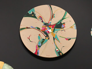
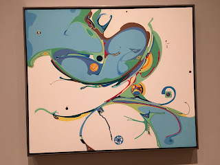
Alex Janvier at the National Art Gallery in Ottawa
Our Text'art group had a lovely visit to see the work of Alex Janvier in Ottawa. He has a wonderful way with colour and design. I've posted a few pictures for you to see.
These last two are from a painting in the National History museum. Above is the entire piece at the top of a stairwell - quite huge and very dramatic. Below is a detail.
Friday, March 31, 2017
Photography Course - March
It's not always easy to get inspired pictures when the weather is either too cold, too rainy or too something. But I guess that's where imagination needs to kick in!!
Thanks for looking, and as always, your comments are most appreciated.
Board Games with a theme of Harmony
This really required imagination as all my games were at the cottage. Nary a pack of cards or cribbage board in the house. I borrowed these four from a friend and used the liquid tool in PS to distort.
Shutter Zoom
An earlier post shows other variations of this. It involves twisting the lens as the photo is being taken to get the streaky/blurred effect. Robbie shoveling at the cottage
Do-Over 1
We had to do one of the techniques over. I chose Tack Sharp which means the photo needs to be sharp from front to back. And an item in front is required to show that you did this. They are taking down a highway in Montreal and it's been quite fascinating watching the process as we drive by. Not too many vantage points though to take a good picture and by the time I found this one, much of the pillars had been taken down.
Composite Montage
I have posted some pictures on an earlier post so show some other examples. We combined a photo taken this week with a texture from a library that was available to us (ones that the class had taken).
This shot was based on my photo of a rusted iron wall on a modern building at MacDonald College in Sainte Anne de Bellevue. I lightened it up quite a bit and then combined it with a photograph of the old mill in Pointe Claire.
Thanks for looking, and as always, your comments are most appreciated.
Composite Montage
For this week's assignment we learned how to merge 2 photos into one in Photoshop. One of these photos was texture and the other provided the subject. Both photos were edited somewhat in either or both of Lightroom and Photoshop. And what fun!
The texture on the left is a photo of a rusted wall. I changed the exposure quite a bit to brighten it up.
The texture below is a photo looking into water with grasses. I turned it into black and white and lightened it.
And for a bit more fun I took one photo from the Shutter Zoom series and combined it with the train picture.

Thanks for looking, and as always, comments are appreciated.
The texture on the left is a photo of a rusted wall. I changed the exposure quite a bit to brighten it up.
The texture below is a photo looking into water with grasses. I turned it into black and white and lightened it.
And for a bit more fun I took one photo from the Shutter Zoom series and combined it with the train picture.

Thanks for looking, and as always, comments are appreciated.
Saturday, March 18, 2017
Shutter Zoom
The assignment for this week in the Ricky Tim's Photography course was shutter zoom and I had so much fun with it that I thought I would share some of the other photos with you. We used Shutter priority on the camera with f8 as a suggested starting point. Most of these were taken in such bright light that I used f22 on some. The idea was to focus on a subject then as the picture was being taken, the lens was twisted to make it zoom in or out. A bit of serendipity in how this works out.
Interestingly there was an ad in the newspaper yesterday which used exactly this technique.
The two below were using pictures that were on the wall at home.
Interestingly there was an ad in the newspaper yesterday which used exactly this technique.
 |
| a poinsetta |
The two below were using pictures that were on the wall at home.
Friday, March 3, 2017
Photography course - February
As a bit of whimsy Ricky asked us to do something with a fork as a theme. There were some creative shots by the others with various eating and serving forks, forks in trees, a fork (literally) on the road, and so I thought of the American Gothic painting and came up with this.
The next theme was Black and White- how to convert in Lightroom and play with the colour if necessary. This is a shot taken at the McGill Arboretum the day after a good snowfall. The original photo was almost b&w as it was such a gray day.
This week the theme is Abandoned. I was trying to channel Edward Burtynsky but it was a very small pile of old tires.
The last for the month is Mirror Image. This was more of a play in Photoshop than anything else. This is part of the course - to learn how to use both Photoshop and Lightroom. This is a wall hanging in stainless steel and painted metal. I turned it into B&W to hide the colour of the wall behind it. I cropped the original picture only on one side, thereby removing the frame so it wouldn't show in the middle. It's a West Coast design by Jack Willoughby
Thank you for looking. I appreciate your comments and suggestions.
 |
| Canadian Gothic |
The next theme was Black and White- how to convert in Lightroom and play with the colour if necessary. This is a shot taken at the McGill Arboretum the day after a good snowfall. The original photo was almost b&w as it was such a gray day.
This week the theme is Abandoned. I was trying to channel Edward Burtynsky but it was a very small pile of old tires.
The last for the month is Mirror Image. This was more of a play in Photoshop than anything else. This is part of the course - to learn how to use both Photoshop and Lightroom. This is a wall hanging in stainless steel and painted metal. I turned it into B&W to hide the colour of the wall behind it. I cropped the original picture only on one side, thereby removing the frame so it wouldn't show in the middle. It's a West Coast design by Jack Willoughby
Thank you for looking. I appreciate your comments and suggestions.
Thursday, February 2, 2017
Photography Course - January
I have signed up for a year long photography course with Ricky Tims who many of you know as a quilter par excellence! He is also an avid photographer and musician. I had the privilege of hearing him play a few years ago. Great concert.
His course is aimed at people with DSLRs and since I have one that I really don't know how to use, I thought it would be a great exercise as we are given an assignment each week which forces me to get the camera out and learn more about it each time.
We have had 5 assignments in January (they come out on Sunday mornings) and we have a week to produce one photograph for submission to his site.
So here are January's. (Since it is winter here, and sometimes very cold or snowing or raining or worse I couldn't always work outside)
Selective Focus: showing shallow depth of field (front in focus, back blurred)
Find a Line: One of the 7 elements in art. Klee said that a line is a dot that has gone for a walk. A rather erratic one in this case! This was taken from the underside of a bird feeder and the serrated edge is a thin sheet of metal designed to keep the squirrels off.
Windows: A very cold week to be outside! The lesson here was to learn a few Lightroom edits.
Tack Sharp: Playing with our f stop and time amongst other things to make the picture be in focus from front to back. This is not an inspired composition, but it did achieve the goal.
One Shape: Learning a bit about composing the shot. This is the underside of a footstool. And with a little play in Lightroom, the colours became a little more playful. We are not allowed to crop just yet.
This is looking to be a fun year and I will try and post my results each month. Thank you for looking and I always appreciate comments and feedback.
Subscribe to:
Comments (Atom)


